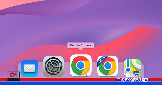
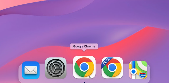
Google is known to have made an update with their logo, which has slightly changed the appearance of the logo of Google Chrome, the browser service that is ranked the most popular today. This is a big change made by Google, since its launch in 2014, Last Wednesday (20/7).
Google is known to have last updated the appearance of Chrome in 2014, then re-updated it in early 2022 this year. When viewed carefully, this change in appearance is found in a much darker color change, and a much simpler dimension.
The striking difference that exists in logo design in 2014 and 2022 is the dimensions, there are several Shadows or shadows that surround each side of the Chrome logo in 2014. Then it begins to be simplified with a darker and shadowless color.
As it turns out, Google has experimented a lot with Chrome logo designs. Google gives a lot of extra look to their logo interface in MacOS users, Apple. By adjusting Apple's style, Chrome now adds a white rectangular-shaped edge that is the hallmark of Apple OS.
In addition, the display on MacOS shows a Chrome logo similar to the general view, but by adding a shadow to the bottom. These shadows make the Chrome look much more attractive, as there is a framed 3D impression.
"With all sorts of ideas and considerations, we tried all the ideas that came to mind; smoother edges, different geometries, adding color with a white frame," said Thomas Messenger as Visual Designer at Google.
Messenger also added that, they simply don't want to abandon the design that became iconfrom Google Chrome. Therefore, at first glance, users will not feel the difference when they see the latest version of the Google Chrome logo, because it still uses the original design in general.
One idea that looks different is the selection of the upper color, which is occupied by the color, which looks similar to the color of Mozilla Firefox. In the end, Google played it safe while retaining their original colors, by adding a white frame to accentuate the Chrome logo.
"We know how good the four google signature colors are, and then stick with those colors in a circular position. Therefore, we don't need to change much," Messenger continued.


